Styling
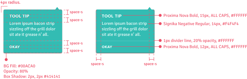
Tooltips should appear on hovering over a trigger and remain in place while the cursor stays on the trigger or within the tooltip. It disappears when the cursor moves out of the target or tooltip area.
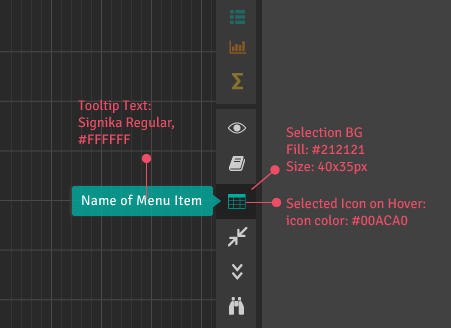
Tool Bar
Show the full name of the object upon hovering over an icon.
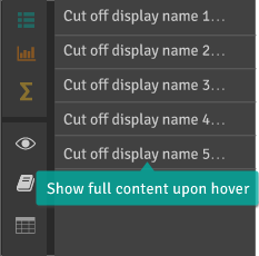
Display Text
Show full text information upon hovering over shortened or limited display text.
Explanatory Text
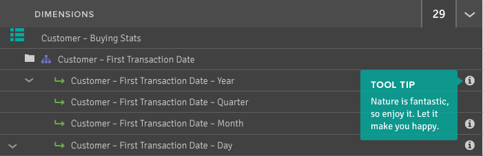
Display informational or explanatory text on hovering over info icons.
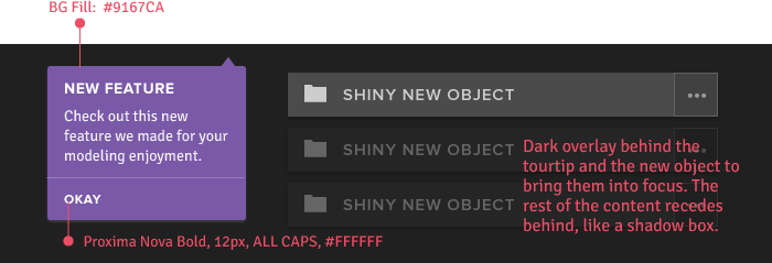
Tour Tips
“Tourtips” introduce new features/objects or help with onboarding. They are automatically triggered upon encountering the new object or page, and the user must take action in order to dismiss it.