Styling
Text
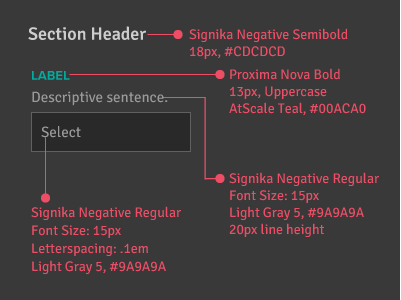
Container
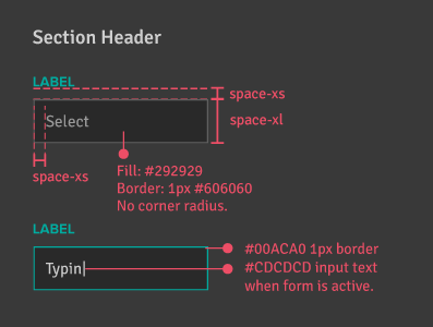
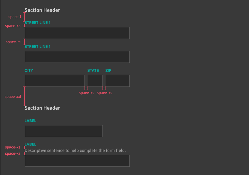
Layout
Feedback Styling
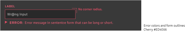
Error
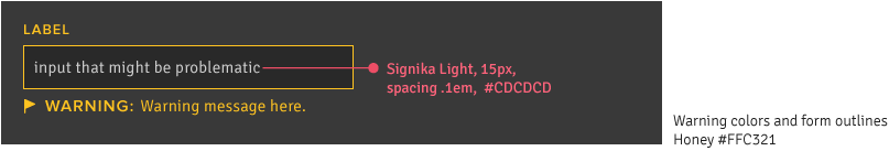
Warning
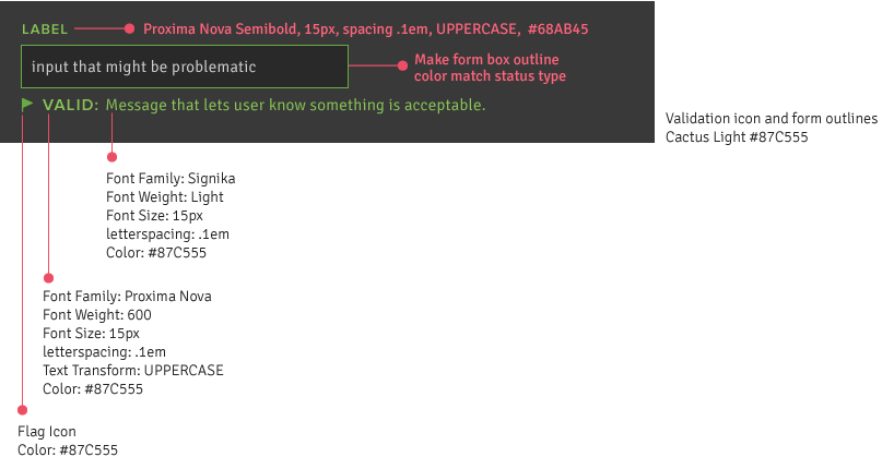
Verification
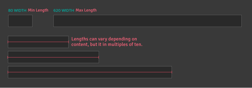
Input Lengths
Best Practice 1
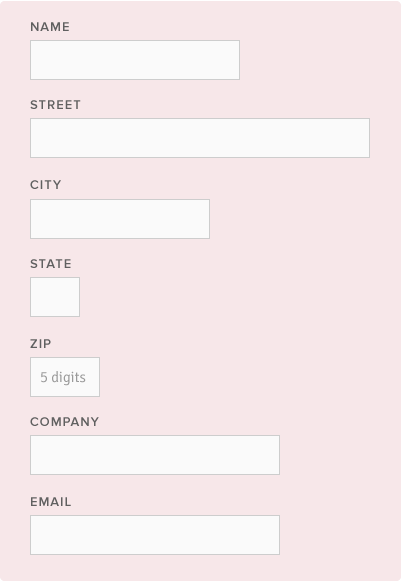
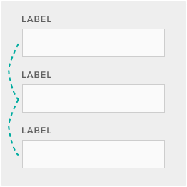
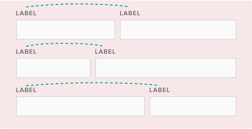
Stack forms vertically so users can predict where the next form will be. This makes it easier and faster to fill out. Multiple columns disrupt a users vertical momentum. There are a few exceptions based on content where breaking this rule makes sense.
Do This
Don't Do This
Best Practice 2
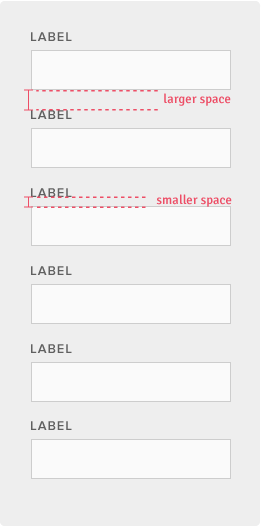
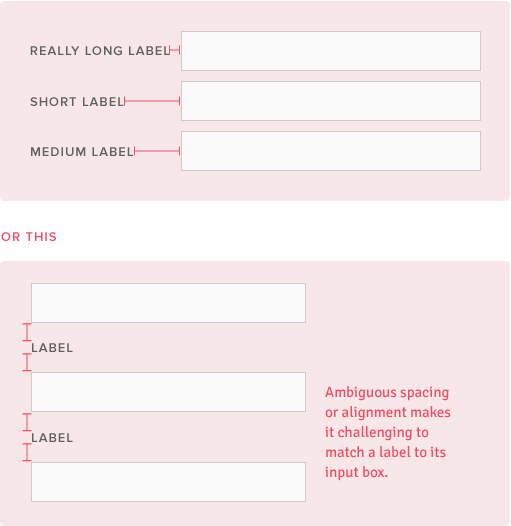
Top align labels and group closely with their inputs. This makes it easy to distinguish the section they are completing.
Do This
Don't Do This
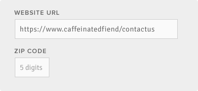
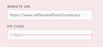
Best Practice 3
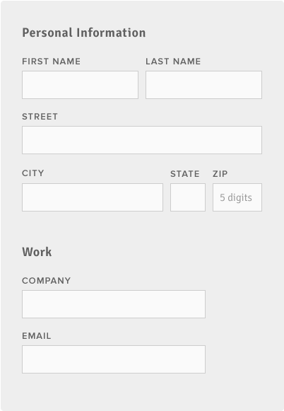
Use appropriate input field lengths to hint at the answer length. Do this for defined character counts like phone numbers, zip codes, etc.
Do This
Don't Do This
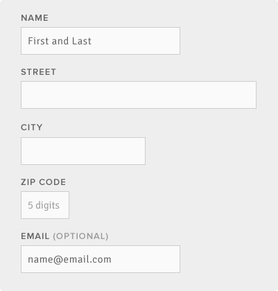
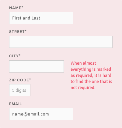
Best Practice 4
Indicate when a field is optional. Use an asterisk (*) for required input fields if they are the minority. Use the word “optional” for optionial fields if the reverse is true.
Do This
Don't Do This
Best Practice 5
Group related content into digestible chunks so users aren't overwhelmed. They can feel progress as they complete each section. Also, it is easier to find the section where they left off when they return.
Do This
Don't Do This