COLORS, STYLES, & STATES
Primary
Text: #FFFFFF
Background: #00ACA0
Box Shadow: 3px, #00887F
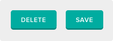
Secondary
Text: #FFFFFF
Background: #0099D4
Box Shadow: 3px, #00739D
Tertiary
Text: #FFFFFF
Background: #606060
Box Shadow: 3px, #515151
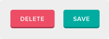
Delete
Text: #FFFFFF
Background: #ED4E66
Box Shadow: 3px, #B13A4F
Hover States
Background: #00887F
Background: #00739D
Background: #515151
Background: #B13A4F
Pressed States
Text: #FFFFFF
Background: #00ACA0
Box Shadow: 3px, #00887F
Filter: drop-shadow
(0 1px 1px #515151);
Text: #FFFFFF
Background: #0099D4
Box Shadow: 3px, #00739D
Filter: drop-shadow
(0 1px 1px #515151);
Text: #FFFFFF
Background: #606060
Box Shadow: 3px, #515151
Filter: drop-shadow
(0 1px 1px #515151);
Text: #FFFFFF
Background: #ED4E66
Box Shadow: 3px, #B13A4F
Filter: drop-shadow
(0 1px 1px #515151);
Disabled State
Text: #9A9A9A
Background:
repeating-linear-gradient
(-55deg,
#616161,
#616161 4px,
#515151 4px,
#515151 6px);
When active, follow same style as tertiary gray button.
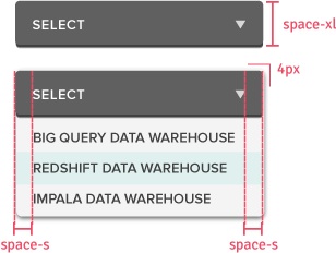
SIZES
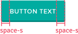
Height is constant. Width changes based on content.
Keep 20px padding on left and right of content.
Height

Corner Radius

Padding
TEXT STYLING
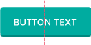
Text Align: center
Font Family: Proxima Nova
Font Weight: 600
Font Size: 13px
Letterspacing: .1em
Text Transform: UPPERCASE
SPECIAL BUTTONS
+ New Object
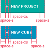
+ New Object buttons include
an icon with 8px space
between the icon and text.
+ New Object
Width determined by content it contains.
Justification: Left Aligned
Padding: 16px left and right
BEST PRACTICE 1
Differentiate primary action from other actions. This indicates to users which action is recommended and which is not.
Do This
Don't Do This